Deliverables
Competitive Analysis, DS Evolution, Design–Dev Collaboration, Accessibility, Documentation
Roles
UX Research, UI Design, Design System
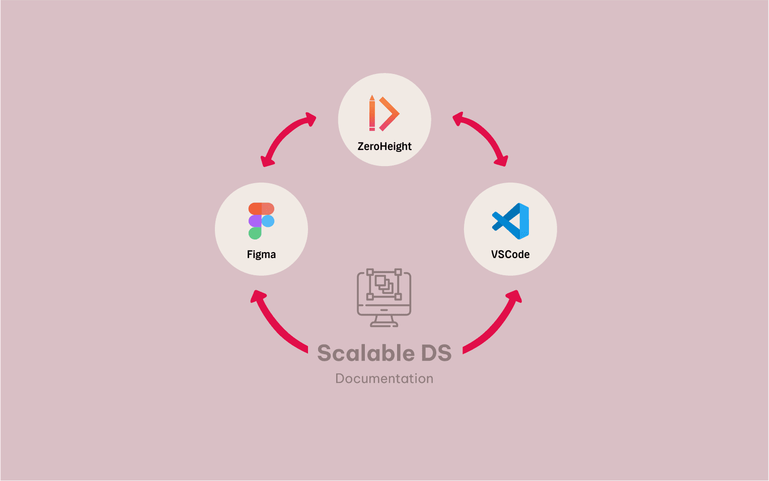
Tools
Figma, Zeroheight, Jira
Project Context
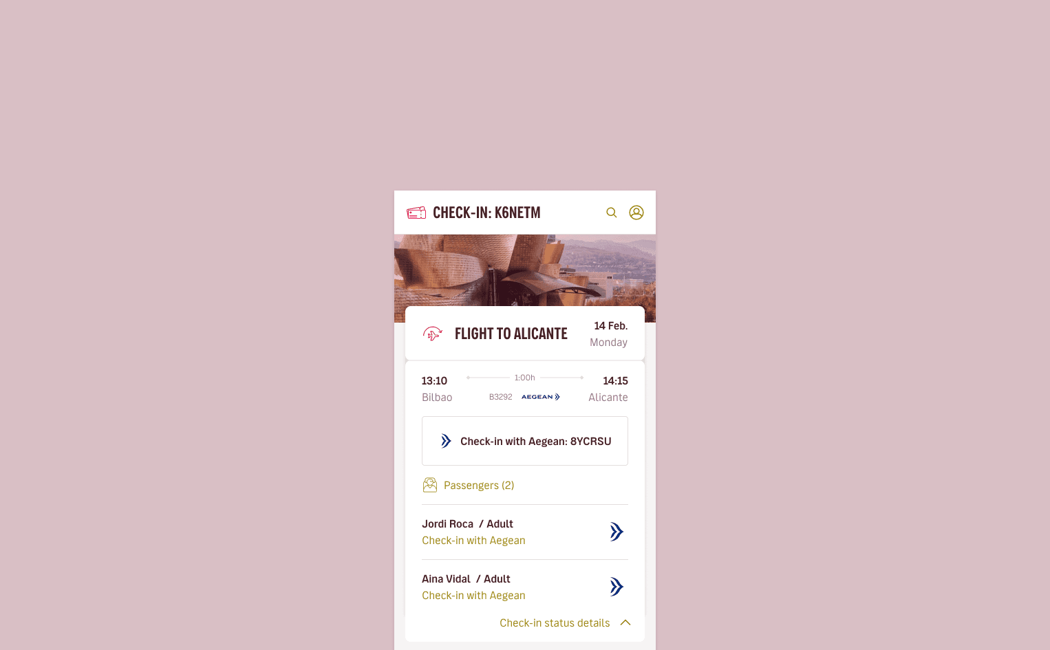
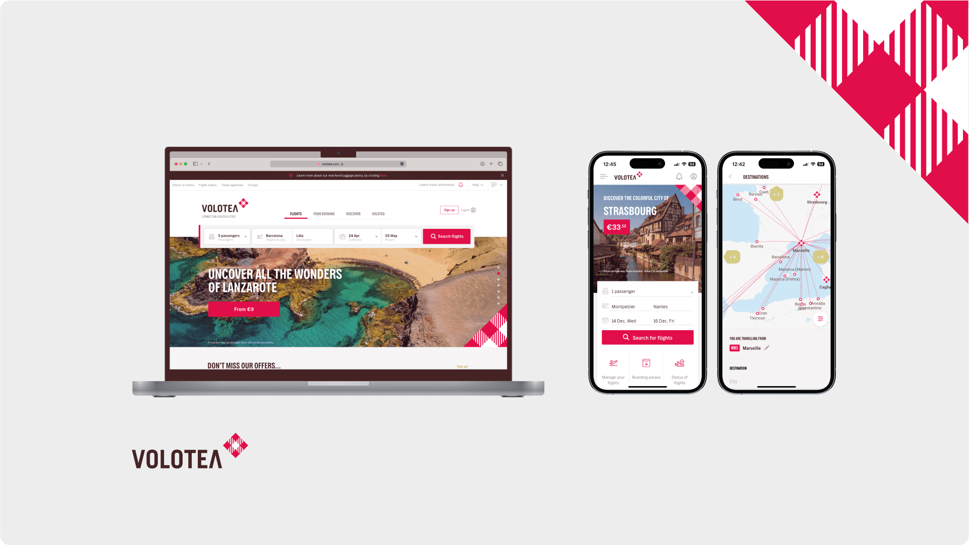
Mobile & Desktop
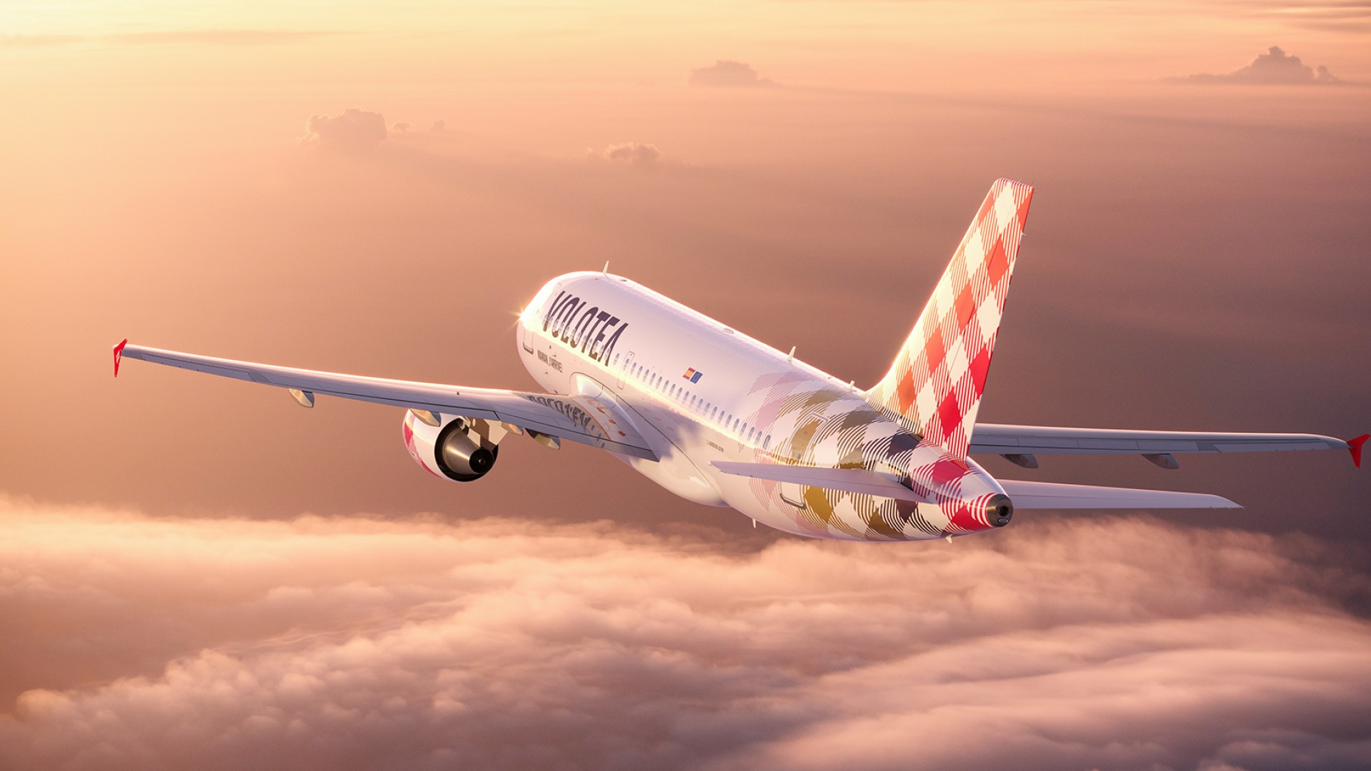
Client
Volotea
Link
Rebuilding Volotea’s DS to achieve visual consistency, faster development, and a smoother collaboration across teams.

Rebuilding consistency across digital experiences
Volotea’s digital ecosystem had grown rapidly over time, resulting in duplicated components, inconsistent visuals, and fragmented documentation. My goal was to help unify and scale the existing Design System: improving the efficiency, accessibility, and collaboration between design and development teams.

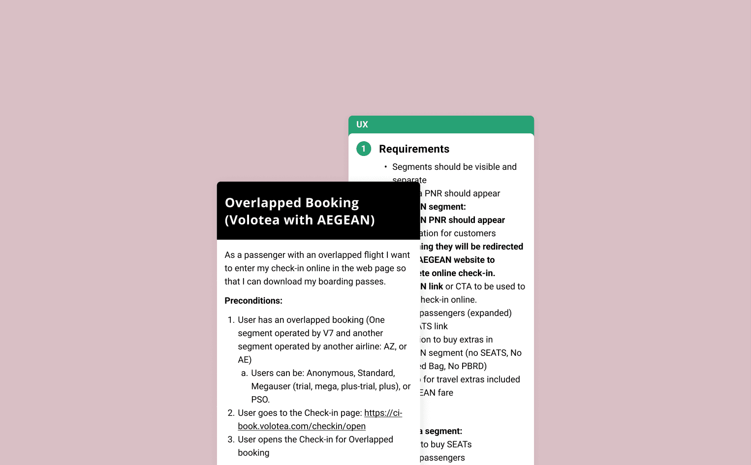
Problem & Opportunity
The existing Design System (Legacy) lacked structure and cohesion. Components were outdated, design tokens weren’t standardized, and multiple Figma libraries caused friction among teams. This presented an opportunity to rebuild the system: bringing together design and development under a shared visual language, ensuring scalability and alignment across platforms.
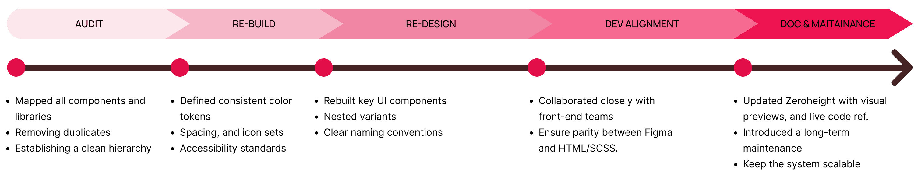
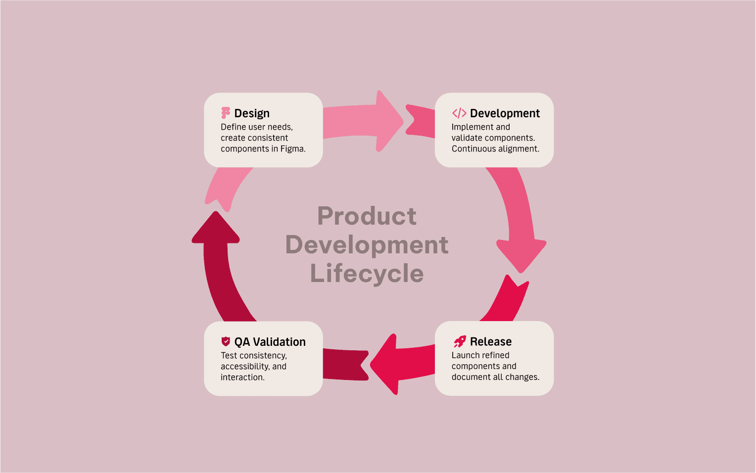
Solution